Task-Creating Workflows
Redesign
How to improve the success rate of complex tasks?

ROLE
UX Designer
DATE
October 2019
- January 2020
PROJECT STATUS
🚀 Launched
FEATURE TEAM
Ricky Zhang (Director), Xingyue Feng(PM)
+ team of 5 software engineers
Project Context
In September 2019 I joined the Infrastructure Department at Tusimple as a new grad designer. and the 4th designer in the team. In the following year, I had been working closely with my PMs and engineers on many great projects.

ECOS UI in October 2019
After a few weeks of new crew learning, my supervisor handed over ECOS to me. The full name of ECOS is Elastic Container Operating Service, technically pretty much like ECS services in AWS. This project was to pull some of the Machine Learning workloads back from AWS to our local servers. In this way, we can not only save millions of dollars per year but also improve efficiency by creating a more Tusimple-customized workflow for our ML engineers.
At that time, ECOS was at a very early stage, with very few functions. So basically it was a very handy project for a new grad designer to get started. My PM wanted to add more functions as quickly as possible. After several rounds of routine iterations, I realized I had three bigger problems to solve.
Problems
Spotting the problem from the data 📈
Besides getting feedback directly from users, we also collect many backend data to analyze and evaluate our products. My PM found that, after several rounds of iterations, there was an indicator staying high, which may reflect that there are some problems in ECOS.
CW: Ratio of all users creating activities to workloads actually created in units of time (per day).
In other words, the lower, the better.

Why users got so many failures when creating workloads?
User Insights
In order to locate the crux, we did 10+ user interviews and tens of observations.
We found that:
#1 Users got overwhelmed by more and more panels
In addition to getting feedback from users, we also use backend data and analyze it to get a more objective evaluation of our product. My PM found that after several iterations, one important indicator remained high, which reflected some problems with our product.

Side Panel Evolution
#2 Task-creating process is getting too long
In the beginning, we just transferred the most basic type of task from AWS to the ECOS platform but the number goes into 4. They are more complex and have more parameters and information to fill in when we create them. This change pulled the creating process from 2 pages into 5-6 pages.
.png)
Developing of Task-Creating Process
#3 We need customized functions.
Some user feedbacks suggest us to add some customized functions to make ECOS stand out from AWS or Aliyun competitors. After all, ECOS has a more specific user group so why not try to create a better experience for Tusimple engineers?

Ideation
From Problems to Features
I analyzed these issues and they are all closely related to the success rate of task creation, From the user's perspective, it's very difficult to navigate, from the get-go to the final step.
I considered solving these problems from different layers
For info-architecture, I believe it was time to put a Dashboard into ECOS and it should. be the start point of users' working processes.

For user interfaces, I believe the multiple-page design for workload creation contributes a lot to the increasing of C/W so I should put all forms back into One-Single-Page.
.png)
For info-architecture, I believe it was time to put a Dashboard into ECOS and it should. be the start point of users' working processes.

Prioritization
Considering the limited resources in the group, we analyzed these 3 problems and decided to solve them one by one.

Before start
#0 New UI Kit was ready to use
While all projects were going on, my design team worked with front-end engineers and developed a new UI kit, Naive UI, which has been open-sourced now. I contributed to part of the design work.
First Step
New workload-creating process
In the initial design, as the workloads were very simple and basic, all things to fill in were on one page.
As workloads getting more and more complex, I segmented all inputs into different steps, and put different steps in continuous full-pages. Users need to fill them in one page by one page.
Now, to compact a Long and Complex process into One-Single-Page, my idea was to replace "Steps" with "Layers".
.png)
Possible Ways to Arrange Multiple Layers in One Page
I tried different ways to display multi-layers content on 1 page. Rolling and Popover could not do that. Dividing into different spaces can display but its capacity was very limited and couldn't use in this scenario. Only the Drawer can satisfy my requirements and I decided to explore this method.
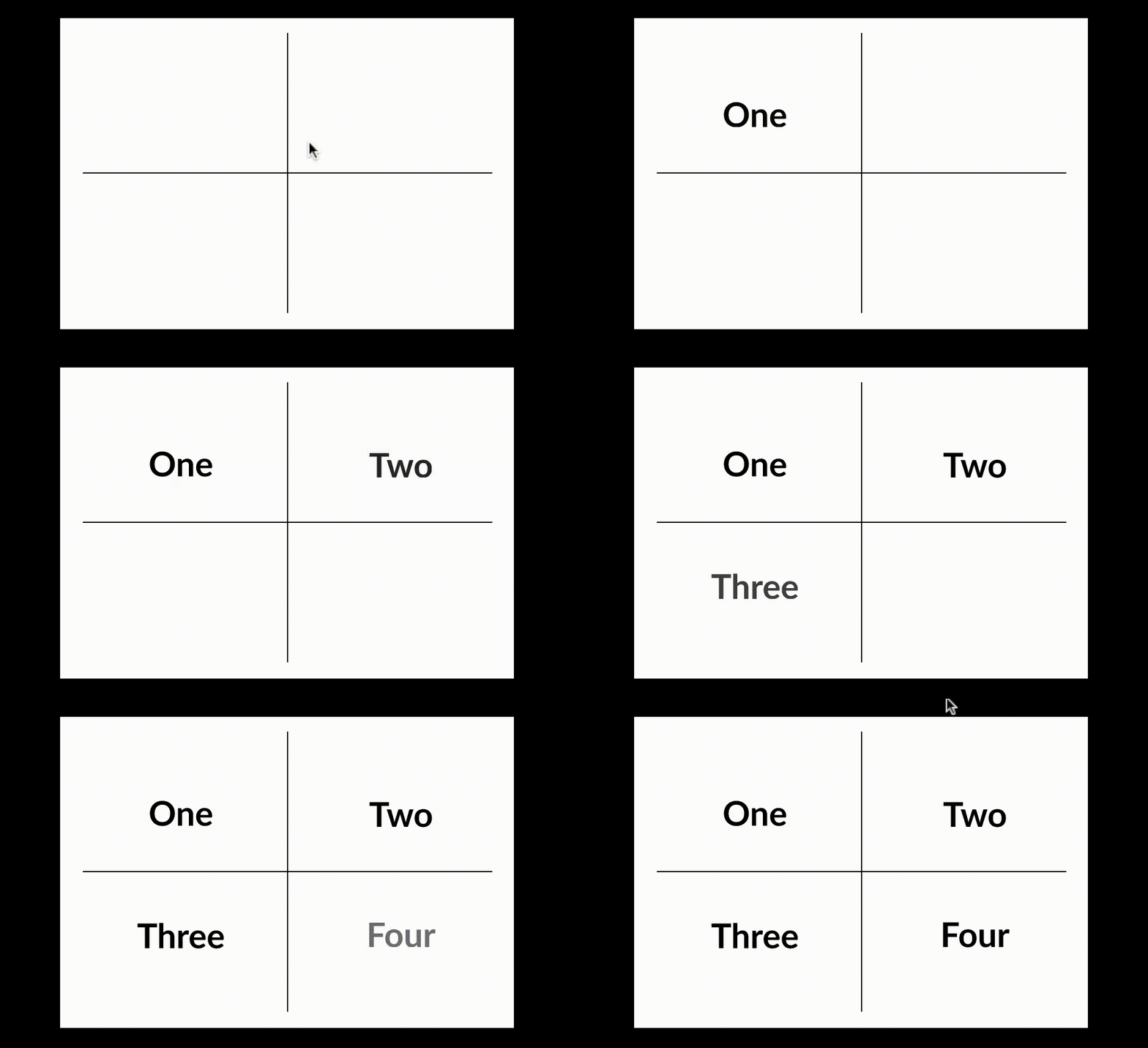
Dividing


Rolling


Popover

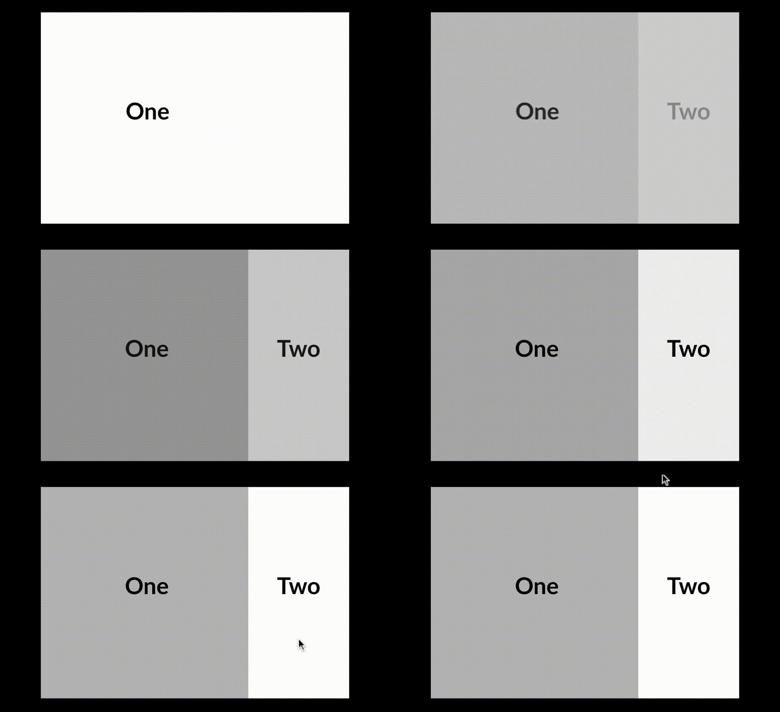
Drawer

Developing the Drawer Solution
As we have at least 3 layers of content, a single drawer can't totally solve our problem. So I decided to explore multi-layer drawers to find the best way to display 3+ layers of content

Overlay

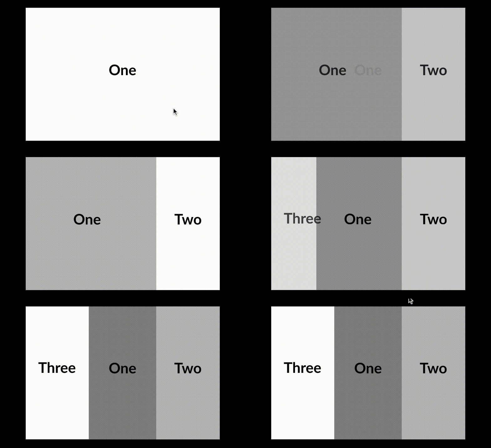
Opposite
.png)

Bottom

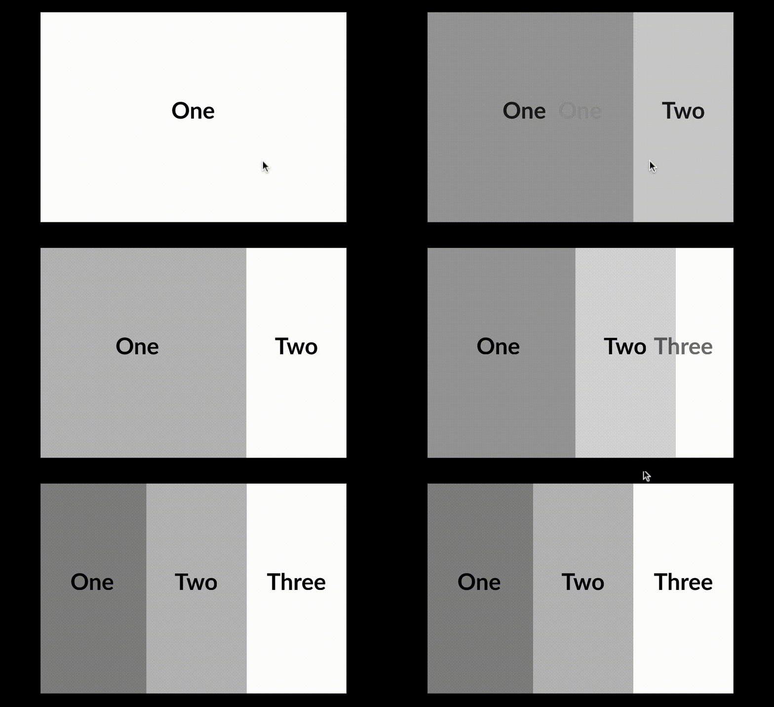
Sequence

My PM and I had different ideas about the best final solution. She insisted the "Opposite" solution would slightly reduce the workload of Frontend engineers and should be considered the final solution. I believe that the "Sequence" solution would give my user a sense of "strengthened order", which would significantly improve the user experience when they are dealing with complex tasks.
Finally, we did some A/B tests, and it turned to prove that my consideration was a key point. Users gave the "Sequence" solution a pretty high rate so we confirmed it as the final solution.

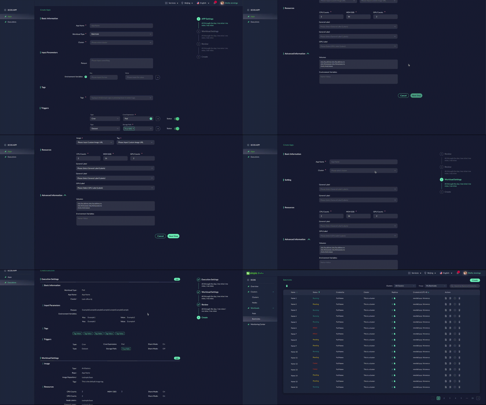
Multi-page Creating Process

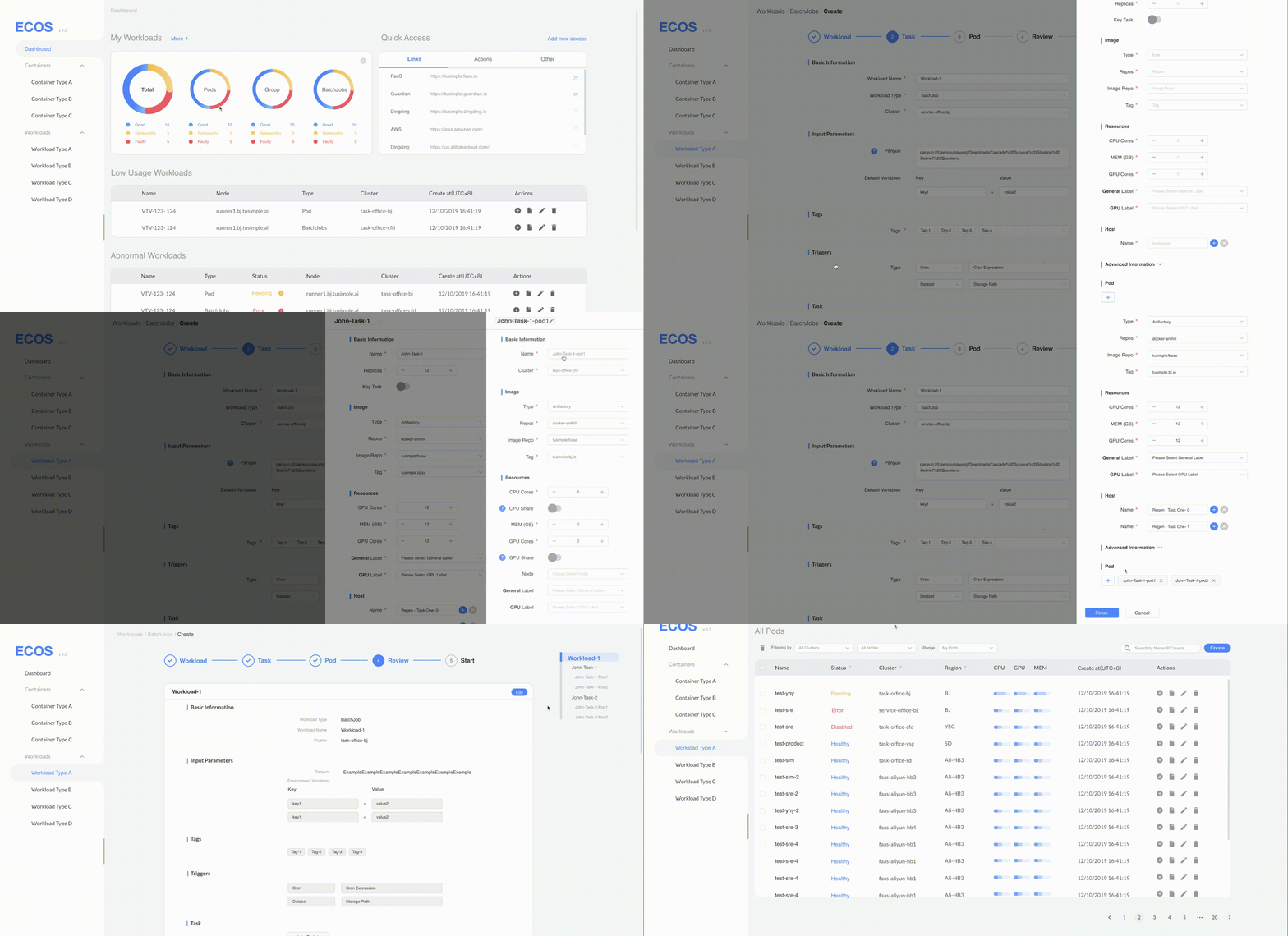
"Sequence" Drawer Creating Process
Second Step
Dashboard Design
Based on user feedback, we came to the conclusion that at that stage we need a dashboard for users to look through all their concerned data, status, resource, etc. This dashboard would also be the place we can put service-level shortcut operation buttons.
.png)

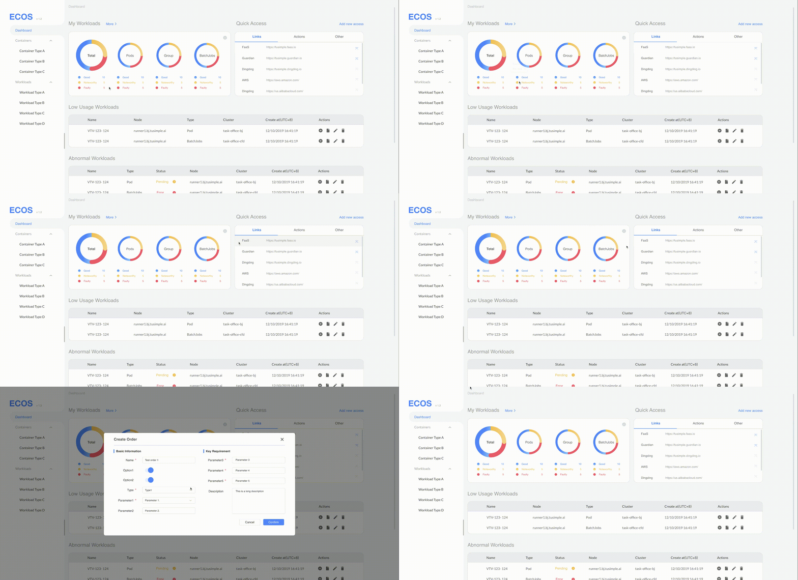

Final User Interface of Dashboard
Updates
A Full-featured ML Workload Platform
Now, almost all types of ML tasks can work on ECOS. Tusimple saves millions of money from their ML budget.
.png)
Impacts
-
Reduced C/W indicator from almost 2 to less than 1.3
-
Provided the huge possibility to add more types of more complex types of ML tasks.
-
Significantly improved the efficiency of ML engineering jobs.
Third Step
Shortcuts for multi-step operations
We would also like to collect some feedback on the most annoying tasks and see whether we can add some quick operation access to the dashboard page. Our user indicated that this idea is pretty promising and when I do step 1&2, users also begin to keep an eye out for their pain points and report them to us.


Retractable Side Panels

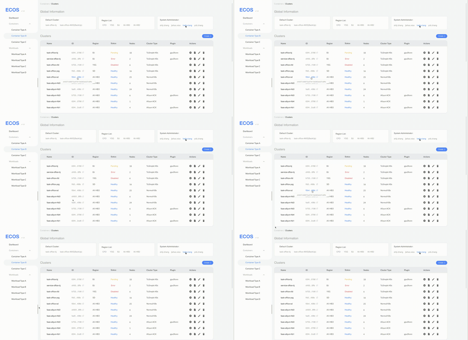
Quickly Copy a Long ID/Name


Shortcuts to Frequently Used Operations
Updates
A Full-featured ML Workload Platform
Now, almost all types of ML tasks can work on ECOS. Tusimple saves millions of money from their ML budget.
.png)
